Best Brand Stores on Amazon
Discover the best brand storefronts on Amazon. From small companies to the biggest brands these companies got it right.
What is a Brand Store?
If you are a registered brand owner on Vendor Central (1P) and Seller Central (3P) you can create a brand store. This mini website is designed and organized by your company and features the items you want to showcase. You can also work with Amazon to get a vanity URL to this page: https://www.amazon.com/your-brand.
Customers can access this page through Paid Advertising or by clicking a brand name or logo in any listing.
Why should you create a branded storefront? While it can be hard to find, it is the one place on Amazon that you can showcase your full product offering with branded collateral.
The Default Brand Store
If you are brand registered and don’t create a branded storefront you will end up with your brand name in text followed by a grid of your products in order of how well they sell. It is very unpolished and doesn’t let customers know that you own your brand on Amazon.
Example: Gibson hasn’t built an Amazon Store yet. This is the default presentation for a brand that is enrolled in Brand Registry.
Your Amazon Brand Store
It is a good investment of your time and resources to claim your Brand Store as your own. Showcase your brand story and what your brand has to offer. Use images, videos and links to your products to do this. You can showcase your complete catalog or a selection of your best-selling or seasonal products. When you build your brand store consider how many marketplaces your business is in and how often your product selection will change. You will need to consider the upkeep needed for your storefront.
It’s also important that you try to limit how deep your navigation on this store goes, customers are likely to drop-off after a click or two and most frequently visit your homepage and top-selling category for that period of time. Brands are finding success in increasing traffic to category pages with visual category navigation on the homepage.
Once built, Amazon stores offer built-in “insights” for you to study. These analytics will give you information on traffic and sales associated with your store. This was also the first place Amazon allowed you to create a source tag that could be applied to outside websites and help you measure the impact those websites and advertising platforms had on your traffic and sales. Amazon has now launched a program called Amazon Attribution which will provide source tags to help you measure that traffic to your individual ASINs.
Best Amazon Brand Stores
Since making Brand Stores available, many brands have customized their storefronts with varying degrees of thoughtful planning and execution. We have combed through the Amazon platform searching for best-in-class examples of Amazon Brand Stores and these are the ones we felt represented that. We aimed to highlight the diversity of marketing intent that can be achieved in these stores.
We liked Escort’s Brand Store because it made a good use of infographics to demonstrate the purpose and features of its product line. It utilized the space to educate the consumer on what its products do. For some brands this is necessary and the most effective way for them to market their products.
Bear Paws is a great example of a small company using their Brand Store well to showcase the product, the company behind the product and the community the product is for. The Brand Store provides the customer with a much better idea of who is behind these products and what you can use them for.
Catchmaster kept it simple. The landing page of their storefront clearly and beautifully highlights the different categories that their brands fall under without wasting a lot of space. This store is simple and effective.
Nicetown used the the homepage of their Brand Store as a product guide. They illustrate all the different options a customer can choose from, educating the customer of the diversity of choice. Once a customer selects a style, they will be redirected to the appropriate category page. They use unique visuals and carefully planned white space to set their Brand Store apart on Amazon.
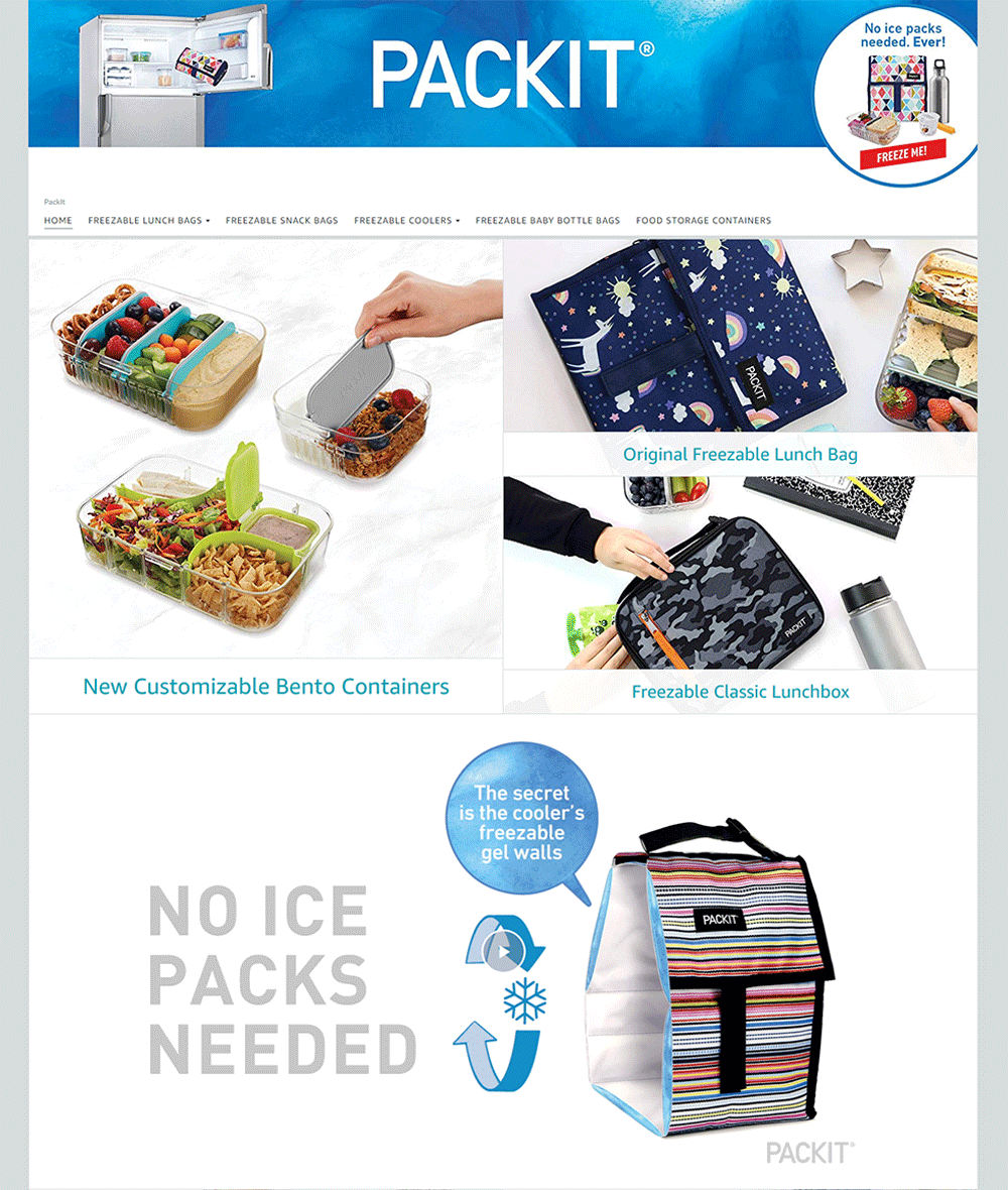
#16 - PACKIT
PACKIT is another example of a small company with an innovative product introducing itself. It demonstrates the unique value proposition of its product and tells the story of the entrepreneur behind the product with video and text. Best of all, it does this well and would likely compel a customer to purchase its products.
Avery found a clever way to give customers the best of both worlds by showcasing the category in a big block on the left and two best-selling products on the right. This permits Amazon Customers to jump to the category or just select a best-selling product.
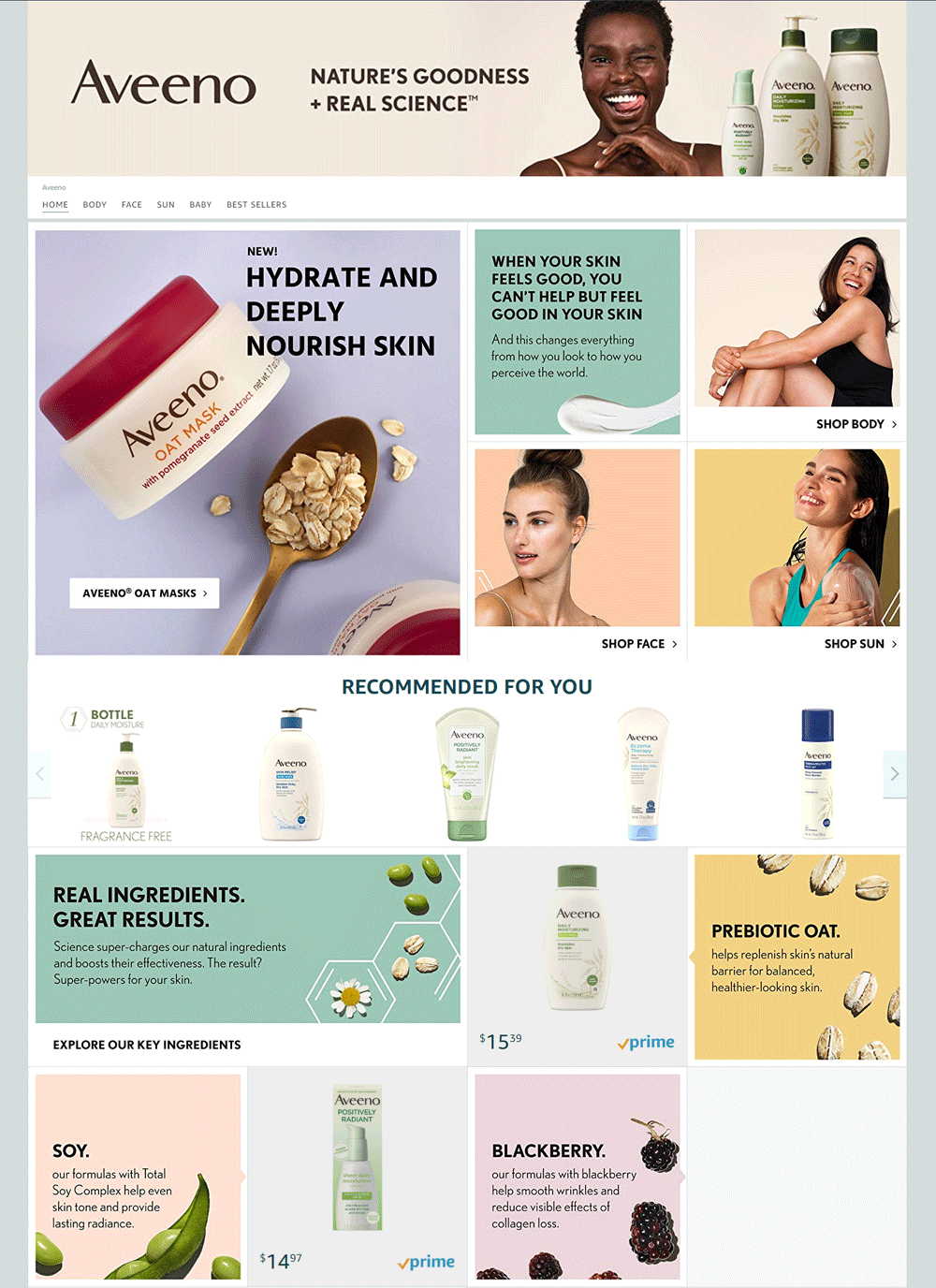
#14 - Aveeno
Aveeno expertly uses soft colors to help you navigate through its Brand Store. It mixes product categories, ingredient call-outs, lifestyle photography and best-selling products to draw you through it’s homepage.
While it may appear to be an overly simple layout, the sparse category graphics brilliantly present the Amazon Customer with a simple question: “What body part do you want to purchase make-up for?” The answer will quickly redirect that customer to the appropriate category page. Cover Girl’s navigation sets a great example of how to guide your customers through your product offering.
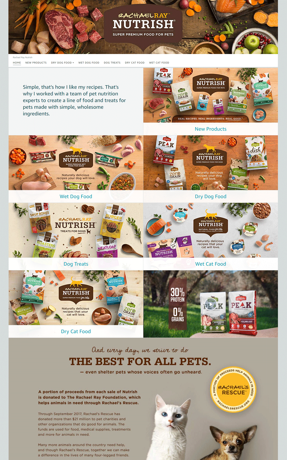
Rachel Ray Nutrish present their category pages in a different and unique way. They use a beautifully photographed and well designed graphic layout of the selection of products and ingredients that reside within each category. You have a pretty good idea of where each category page is going to lead you, but you won’t get to a specific product without clicking through.
The Melissa & Doug Brand Store has too much content. Some of the content and graphics on this page are fantastic. Their use of color combined with white space around lifestyle photography is extremely compelling. They present you with terrific features to “Shop by Age” or “Shop by Category.” They lead with relevant, seasonal content. They also include video to tell you their brand story. They end with more wonderful brand related content. The problem is, the effectiveness of the content is lost, simply because there is too much of it. With some editing, they could have one of the strongest Brand Stores on Amazon.
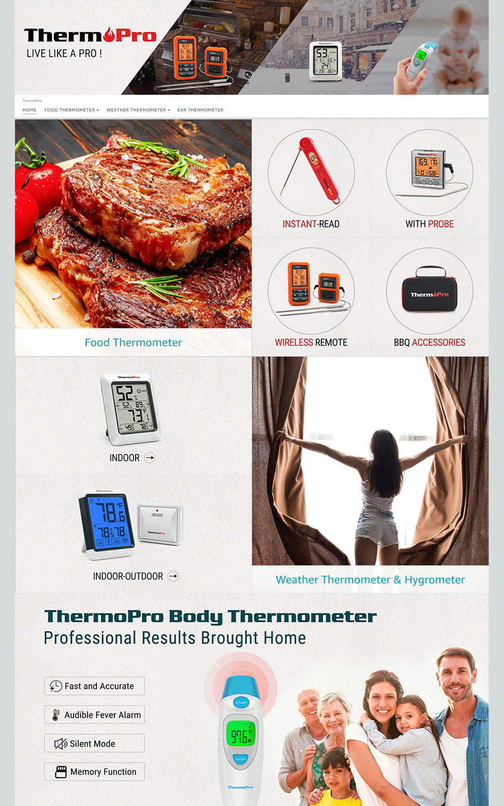
ThermPro makes three kinds of thermometers: food, indoor / outdoor temperature and healthcare. With clear graphics and layout they inform you of this and let you navigate to the appropriate category pages. They are effective at quickly informing the customer where their expertise lies and where to find the appropriate product.
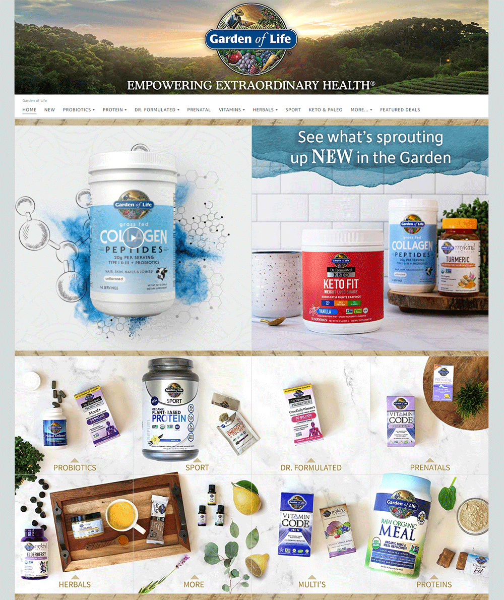
The Garden of Life does a good job of beautifully showcasing a line of products and product categories. The craft with which this was done is further noted when you consider how little visual appeal a bottle of supplements and / or vitamins typically has and how beautiful and complete they look in this layout.
Coleman took a similar approach to Avery in the layout of their Brand Store. They highlight the product categories on the left and the top-selling products on the right. It is an interesting way to present a customer with a choice for how deep they wish to navigate.
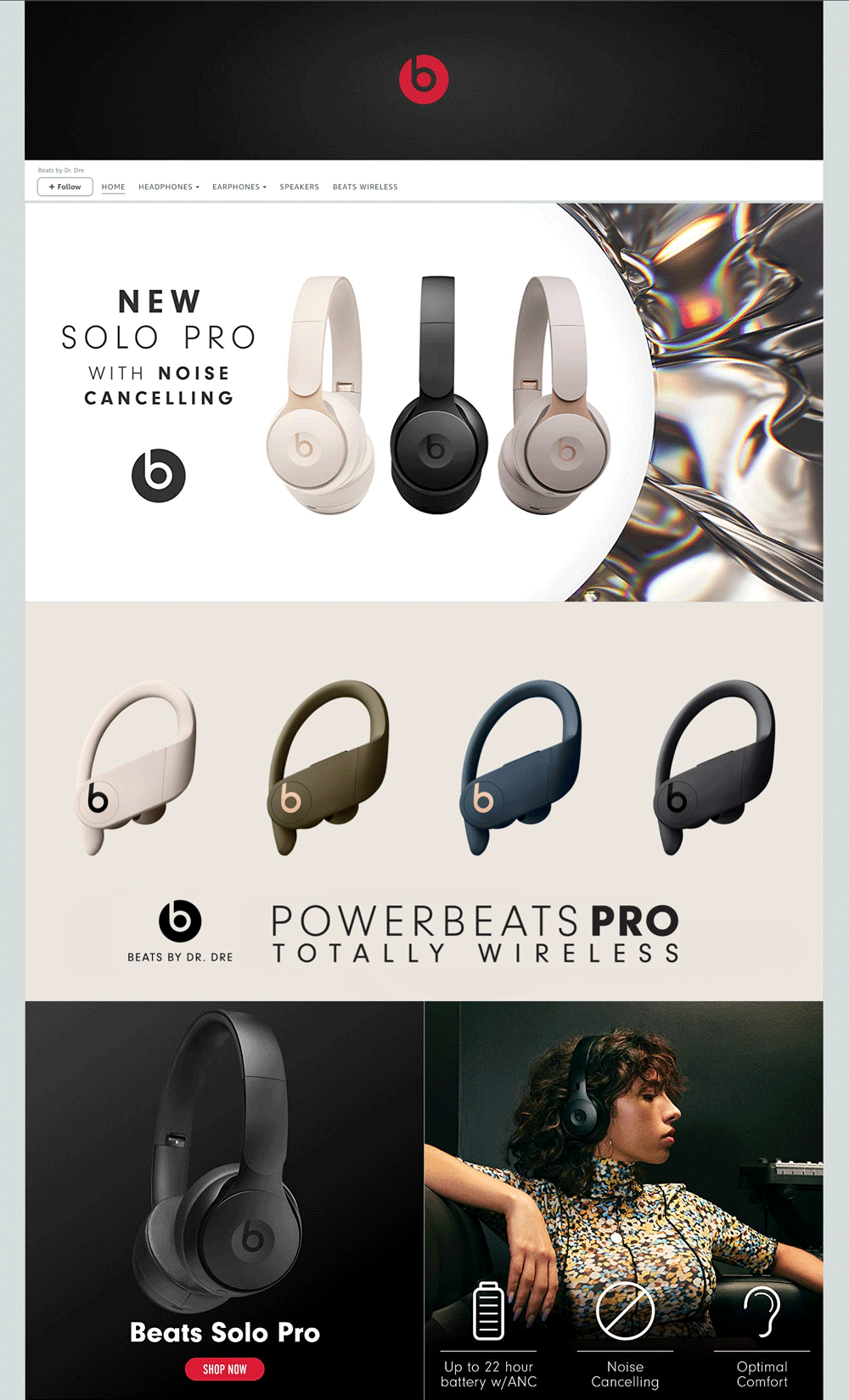
Beats’ Brand Store is focused on hit products. With gorgeous photography and infographics this page is at another level. It does a good job of reinforcing the luxury feel of the Beats’ brand.
Graphically clean and consistent the Nespresso Brand Store draws you through two product categories and finishes by drawing your attention to their mission as a brand. It is a beautiful, enticing and effective Brand Store.
When it comes to branding, Apple has always been among the best, if not the best. Why should it be any different with their Amazon Brand Store? They do a beautiful job of showcasing their iconic products to entice you to click on their category pages.
For us, this newer, smaller, brand hangs out with the big brands with its well-designed and well-executed Brand Store. Great photography, great color and a simple and clean layout make this a really strong store.
Many luxury brands have struggled to infuse the power of their brand into their Amazon Storefronts. Clarks’ does this well. They skillfully give their store a luxury feel, highlight best-selling products and bait customers into clicking through to their category pages.
You need to applaud the Scotts’ team for creating exceptionally strong seasonal content which both educates the customer and encourages them to purchase seasonally relevant products. The Scotts’ Brand Store leads off with a dynamic message in motion that features strong visuals. As you scroll down the page, you will be further captivated by the colorful category page graphics that entice customers to click further into the brand store.
#1 - Mars Wrigley Confectionery - Altoids and Combos
What do you do when you have many famous brands? Mars Wrigley Confectionery made one Brand Store with a unique landing page for each brand. The pages are exquisitely branded, feature links to products and give customers the ability to explore all the brands under the Mars Wrigley Confectionery umbrella. Maintaining both the individual and group identity of these brands is commendable and why we gave them the top spot in our rankings.
Summary
We hope you’ll notice that there is no one right way to create a Brand Store on Amazon. You will need to do what is best for your brand, your product and your team. Your Brand Store will be unique and evolve as the seasons, your products and your brand itself, change. It will change as you study your Brand Store “insights” and learn how customers are responding to your content. Creating great content that drives sales is an iterative process.
Good luck with making your Brand Store. If you need help creating a Brand Store or growing your Amazon business please fill out our contact form.


